Masonry 是多年来网络一直在努力解决的问题,但没有找到真正有意义的原生解决方案。在 Web 开发和应用程序构建中,砌体是指在 Pinterest 上最常用的布局类型,其中元素“填补”了它们下方的空白。这与具有固定行宽的 flex 或 grid 有很大不同。
今天有很多方法可以用 Javascript 实现砌体,甚至还有一个非常流行的Javascript Masonry 插件。不过,一直缺乏真正的原生 CSS 解决方案。今天,正在开发一个新规范,将原生砌体直接引入 CSS,而不需要 Javascript。在本文中,我们将介绍 CSS masonry。
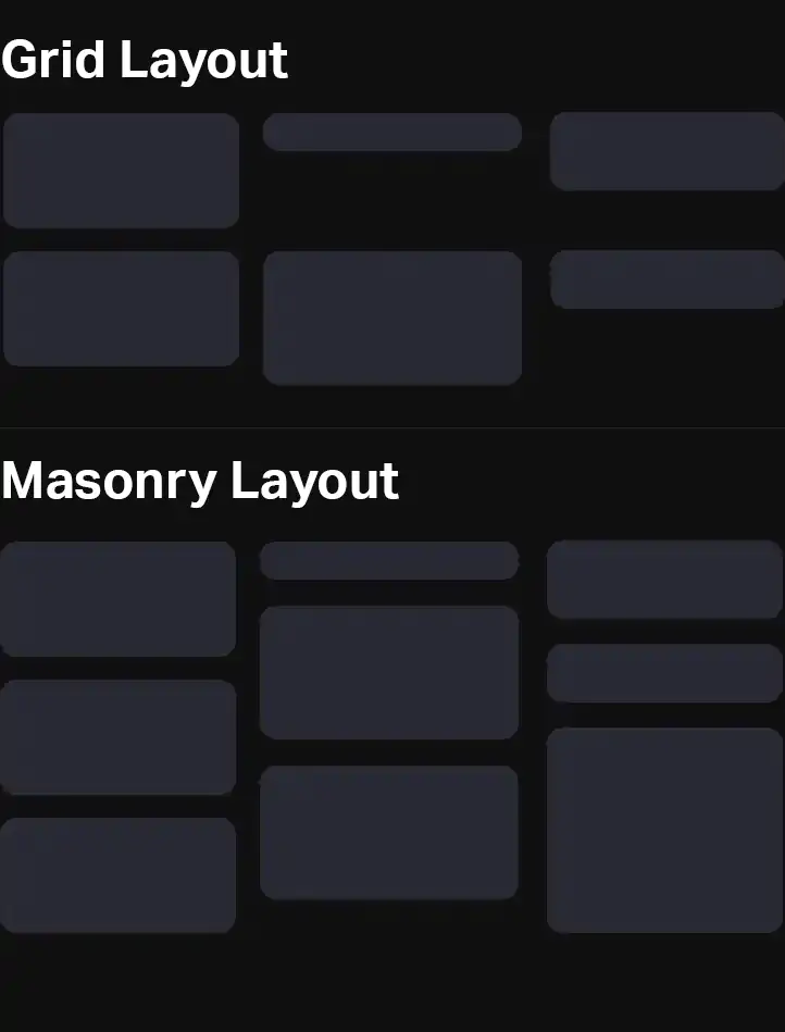
使用 CSS Masonry 创建砌体#
CSS 工作组现在已经创建了一个仅使用 CSS 的砌体提案,只使用几行代码,它可以在水平轴和垂直轴上工作。
.container {
    display: grid;
    grid-template-columns: 20% 20% 20% 20%;
    grid-template-rows: masonry;
    align-tracks: start; // A new masonry only property
    justify-tracks: start; // A new masonry only property
}
砌体规范还将引入两个新属性:align-tracks和justify-tracks。它们的工作方式与 and 非常相似,align-content接受justify-content值start, end, center,stretch和。space-betweenspace-evenly
虽然目前处于提案阶段,但砌体很难标准化。例如,项目是否应该自动填补空白?你如何管理订单?或者屏幕阅读器应该以什么顺序阅读这些框?
由于所有这些不确定性,任何现代浏览器都不支持 CSS masonry,因为规范可能会更改。最终,这意味着我们今天无法仅使用 CSS 生成可靠的砌体。
CSS Masonry 作为网格特征的争论?
CSS masonry 是否符合网格规范还有待商榷。网格,就其自身的性质而言,是固定的结构。网格规范是否是放置砌体的正确位置是值得怀疑的。
在 CSS 中,网格有行,可以分配项目。如果我们决定把它变成砖石,项目将能够重叠行并同时分配到不同的行。
在某些方面,masonry 更适合 CSS flexbox 规范,因为 masonry 列和行更像 flexbox 列和行。Flexbox 甚至听起来是对的——一个可以弯曲的盒子可以垂直和水平弯曲。
无论放置 CSS masonry 的正确位置如何,今天我们都必须使用其他方法在我们的应用程序中实现它。
今天用 Javascript 实现砌体#
由于原生且广泛支持的 CSS masonry 遥不可及,因此今天实现 masonry 需要一点 Javascript。幸运的是,这并不像你想象的那么难。Masonnry 通常会做一些事情:
- 填补差距
- 自动调整以适应 CSS 更改
- 创建一个正确高度的容器
虽然这是一个静态实现,但如果添加更多项目,您可以重新运行 Javascript 进行更新。
尽管添加一些 Javascript 为我们提供了一个比当前 CSS 实现更灵活的解决方案,但可以使用此处所示的CSS 来执行此操作。
使用大约 35 行 Javascript,我们可以递归地将元素内的所有 div 放入砌体中。我们还可以识别项目落入哪些列,并设置容器的最大高度。
完整的演示可以在下面查看。你可以在这里找到 CodePen 的完整代码。.
let mainId = 'masonry-effect';
let itemIdentifier = '#masonry-effect .item';

document.addEventListener('DOMContentLoaded', function(e) {

    // Programmatically get the column width
    let item = document.querySelector(itemIdentifier);
    let parentWidth = item.parentNode.getBoundingClientRect().width;
    let itemWidth = item.getBoundingClientRect().width + parseFloat(getComputedStyle(item).marginLeft) + parseFloat(getComputedStyle(item).marginRight);
    let columnWidth = Math.round((1 / (itemWidth / parentWidth)));

    // We need this line since JS nodes are dumb
    let arrayOfItems = Array.prototype.slice.call( document.querySelectorAll(itemIdentifier) );
    let trackHeights = {};
    arrayOfItems.forEach(function(item) {
        // Get index of item
        let thisIndex = arrayOfItems.indexOf(item);
        // Get column this and set width
        let thisColumn = thisIndex % columnWidth;
        if(typeof trackHeights[thisColumn] == "undefined") {
            trackHeights[thisColumn] = 0;
        }
        trackHeights[thisColumn] += item.getBoundingClientRect().height + parseFloat(getComputedStyle(item).marginBottom);
        // If the item has an item above it, then move it to fill the gap
        if(thisIndex - columnWidth >= 0) {
            let getItemAbove = document.querySelector(`${itemIdentifier}:nth-of-type(${thisIndex - columnWidth + 1})`);
            let previousBottom = getItemAbove.getBoundingClientRect().bottom;
            let currentTop = item.getBoundingClientRect().top - parseFloat(getComputedStyle(item).marginBottom);
            item.style.top = `-${currentTop - previousBottom}px`;
        }
    });
    let max = Math.max(...Object.values(trackHeights));
    document.getElementById(mainId).style.height = `${max}px`;
});
#masonry-effect {
    display: flex;
    flex-direction: row;
    flex-wrap: wrap;
}
.item {
    flex-direction: column;
    margin-right: 1rem;
    margin-bottom: 1rem;
    position: relative;
    width: calc(33.3% - 1rem);
    background: linear-gradient(45deg, #281dd4, #a42bff);
    border-radius: 10px;
    padding: 1rem;
    font-size: 1.25rem;
    box-sizing: border-box;
    font-weight: 600;
}
简单砌体演示
项目 1第 2 项第 3 项第 4 项第 5 项第 6 项第 7 项第 8 项第 9 项项目 10项目 11第 12 项
结论#
总之,今天,砌体可以用一些非常轻量级的 Javascript 来实现,几年后我们可能会有原生的 CSS 解决方案。我希望你觉得这个页面有用!
你如何看待 CSS 中的砌体?在推特上告诉我你的想法。

")

")

