Qt自定义控件封装
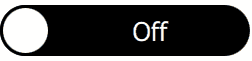
继续我们的QML Controls from Scratch系列,这次我们将实现一个 Switch。Switch 与CheckBox类似,不同之处在于它具有可滑动的药丸(通过 MouseArea 和拖动属性实现)并且没有文本属性。可以通过点击或拖动来切换开关。
Switch.qml
import QtQuick 2.0

Rectangle {
    id: root

// public
    property bool checked: false

    signal clicked(bool checked);  // onClicked:{root.checked = checked;  print('onClicked', checked)}

// private
    width: 500;  height: 100 // default size
    border.width: 0.05 * root.height
    radius:       0.5  * root.height
    color:        checked? 'white': 'black' // background
    opacity:      enabled  &&  !mouseArea.pressed? 1: 0.3 // disabled/pressed state

    Text {
        text:  checked?    'On': 'Off'
        color: checked? 'black': 'white'
        x:    (checked? 0: pill.width) + (parent.width - pill.width - width) / 2
        font.pixelSize: 0.5 * root.height
        anchors.verticalCenter: parent.verticalCenter
    }

    Rectangle { // pill
        id: pill

        x: checked? root.width - pill.width: 0 // binding must not be broken with imperative x = ...
        width: root.height;  height: width // square
        border.width: parent.border.width
        radius:       parent.radius
    }

    MouseArea {
        id: mouseArea

        anchors.fill: parent

        drag {
            target:   pill
            axis:     Drag.XAxis
            maximumX: root.width - pill.width
            minimumX: 0
        }

        onReleased: { // releasing at the end of drag
            if( checked  &&  pill.x < root.width - pill.width)  root.clicked(false) // right to left
            if(!checked  &&  pill.x)                            root.clicked(true ) // left  to right
        }

        onClicked: root.clicked(!checked) // emit
    }
}
Test.qml
import QtQuick 2.0

Switch {
    property bool backend: false

    checked:   backend

    onClicked: backend = checked
}

")


