Qt自定义控件封装
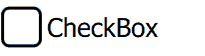
继续我们从头开始的 QML 控件系列,这次我们将实现一个 CheckBox。我们还将几乎免费获得 RadioButton。CheckBox 与 Button 类似,不同之处在于它在checked属性中保持选中/未选中状态。所有 QML 属性都有一个关联的 *Changed 信号,因此checkedChanged()信号会导致onCheckedChanged在属性检查更改时运行。
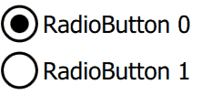
如果客户端设置了 radio: true,CheckBox 也可以用作单选按钮,这就是 RadioButton.qml 所做的一切。要让多个单选按钮在一个组中一起起作用,请将 RadioButton 放在 ListView 委托中,其 currentIndex 指示当前选定的单选按钮(参见下面的 test.qml)。
由于我们没有使用图像,因此我们使用了检查✓(十六进制 2713)unicode字形将复选标记呈现为文本,但您可能希望使用设计器提供的图像 .png 资产替换。RadioButton 点是使用 Rectangle 实现的。
看一看:
CheckBox.qml
import QtQuick 2.0

Item {
    id: root

// public
    property string text:    'text'
    property bool   checked: false

    signal clicked(bool checked);   //onClicked:{root.checked = checked;  print('onClicked', checked)}

// private
    property real padding: 0.1    // around rectangle: percent of root.height
    property bool radio:   false  // false: check box, true: radio button

    width: 500;  height: 100                         // default size
    opacity: enabled  &&  !mouseArea.pressed? 1: 0.3 // disabled/pressed state

    Rectangle { // check box (or circle for radio button)
        id: rectangle

        height: root.height * (1 - 2 * padding);  width: height // square
        x: padding * root.height
        anchors.verticalCenter: parent.verticalCenter
        border.width: 0.05 * root.height
        radius: (radio? 0.5: 0.2) * height

        Text { // check
            visible: checked  &&  !radio
            anchors.centerIn: parent
            text: '\u2713' // CHECK MARK
            font.pixelSize: parent.height
        }

        Rectangle { // radio dot
            visible: checked  &&  radio
            color: 'black'
            width: 0.5 * parent.width;  height: width // square
            anchors.centerIn: parent
            radius: 0.5 * width // circle
        }
    }

    Text {
        id: text

        text: root.text
        anchors {left: rectangle.right;  verticalCenter: rectangle.verticalCenter;  margins: padding * root.height}
        font.pixelSize: 0.5 * root.height
    }

    MouseArea {
        id: mouseArea

        enabled: !(radio  &&  checked) // selected RadioButton isn't selectable
        anchors.fill: parent

        onClicked: root.clicked(!checked) // emit
    }
}
RadioButton.qml
import QtQuick 2.0

CheckBox {
    radio: true
}
Test.qml
CheckBox {
    property bool backend: false

    text: 'CheckBox'
    checked:   backend

    onClicked: backend = checked
}

ListView { // RadioButton
    id: radioButtons

    interactive: false

    model: [{text: 'RadioButton 0'}, {text: 'RadioButton 1'}]

    delegate: RadioButton {
        text:      modelData.text
        checked:   radioButtons.currentIndex == index // equality

        onClicked: radioButtons.currentIndex  = index // assignment
    }
}
概括
在这篇文章中,我们创建了 CheckBox 和 RadioButton。下次我们将创建 Switch。源代码可以在这里下载。


