介绍
Toast 对于向用户显示一些信息非常有用。它具有广泛的用途,从显示成功操作的成功消息、在出现问题时显示错误消息等等。今天我们将使用 HTML 和 CSS 构建一个简单的 toast。我们将使用一些 javascript 来添加一些交互性。
我们将制作一个在单击按钮时显示的 toast。也可以通过单击关闭按钮将其关闭,隐藏起来。
Codepen – https://codepen.io/anishde12020/pen/JjrYMrW
基本的 CSS 来祝酒
要使吐司动画进出,我们需要先制作吐司。对于这个例子,我将在一个框中添加一个简单的图标和一些文本,这将是我们的吐司。
所以,在标记中,让我们首先添加一个divfor out toast –
<div class="toast" id="toast"></div>
现在,我们需要添加一个图标。我将从HeroIcons中获取一个简单的信息图标并放入 SVG
<div class="toast" id="toast">
  <svg xmlns="http://www.w3.org/2000/svg" fill="none" class="icon" viewBox="0 0 24 24" stroke="currentColor">
    <path stroke-linecap="round" stroke-linejoin="round" stroke-width="2" d="M13 16h-1v-4h-1m1-4h.01M21 12a9 9 0 11-18 0 9 9 0 0118 0z" />
  </svg>
</div>
让我们也添加一个文本
<div class="toast" id="toast">
  <svg xmlns="http://www.w3.org/2000/svg" fill="none" class="icon" viewBox="0 0 24 24" stroke="currentColor">
    <path stroke-linecap="round" stroke-linejoin="round" stroke-width="2" d="M13 16h-1v-4h-1m1-4h.01M21 12a9 9 0 11-18 0 9 9 0 0118 0z" />
  </svg>
  <p class="text">Some Information</p>
</div>
这就是我们的页面应该的样子
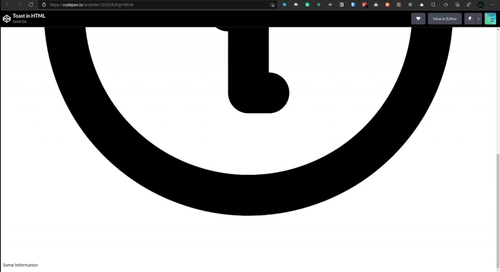
图像.png
图标太大了,甚至不适合视图。让我们用一些 CSS 来修复这个设计,然后设置它的样式。
首先,我们将通过定义宽度和高度来设置图标的样式 –
.icon {
  height: 2rem;
  width: 2rem;
}
现在让我们将 toast 设置为 flexbox 并在图标上添加一些边距。我还将使用绝对位置将吐司放置在右上角。
.icon {
  height: 2rem;
  width: 2rem;
  margin-right: 1rem;
}

.toast {
  display: flex;
  align-items: center;
  position: absolute;
  top: 50px;
  right: 80px;
}
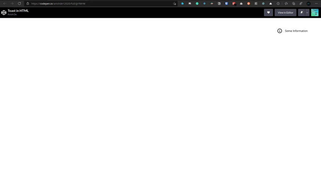
图像.png
一切看起来都不错,除了造型。让我们添加一些颜色和其他样式:
.icon {
  height: 2rem;
  width: 2rem;
  margin-right: 1rem;
  color: white;
}

.text {
  color: white;
}

.toast {
  display: flex;
  align-items: center;
  position: absolute;
  top: 50px;
  right: 80px;
  background-color: black;
  border-radius: 12px;
  padding: 0.5rem 1rem;
  border: 5px solid #029c91;
}
我们更改了 toast 的背景颜色,为其添加了边框,添加了一些边框半径,并更改了图标和文本的颜色,以便它们在黑色背景上可见。
这就是我们的 toast 现在的样子:
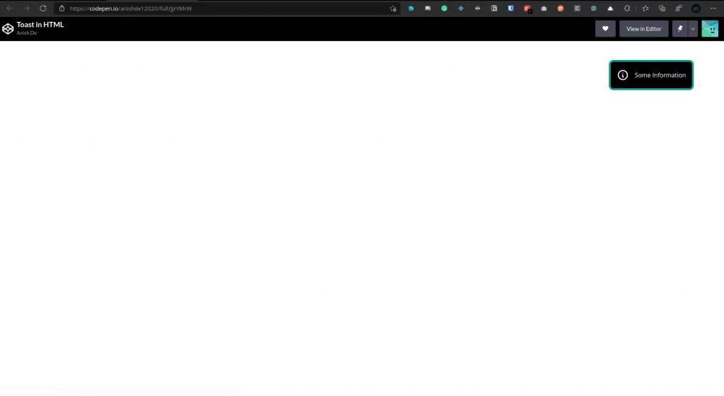
图像.png
让我们也添加一个会触发动画的按钮,即显示 toast –
<div class="toast" id="toast">
  <svg xmlns="http://www.w3.org/2000/svg" fill="none" class="icon" viewBox="0 0 24 24" stroke="currentColor">
    <path stroke-linecap="round" stroke-linejoin="round" stroke-width="2" d="M13 16h-1v-4h-1m1-4h.01M21 12a9 9 0 11-18 0 9 9 0 0118 0z" />
  </svg>
  <p class="text">Some Information</p>

</div>

<button id="show-toast" class="show-toast">Show Toast</button>
让我们也为这个按钮设置样式,因为它现在看起来很丑
.show-toast {
  background-color: black;
  color: white;
  border-radius: 8px;
  padding: 8px;
  cursor: pointer;
}
让我们也禁用任何溢出:
html,
body {
  overflow: hidden;
}
这就是现在一切的样子:
添加动画
现在我们有了 toast 和触发动画的按钮,是时候添加动画了。
首先,我们将通过将 toast 放在视图之外来为 toast 提供一个起点。所以让我们编辑吐司的 CSS:
.toast {
  display: flex;
  align-items: center;
  position: absolute;
  top: 50px;
  right: -500px;
  background-color: black;
  border-radius: 12px;
  padding: 0.5rem 1rem;
  border: 5px solid #029c91;
  opacity: 0%;
}
现在让我们创建一个名为的新类toast-active,只要单击按钮,它就会被添加到 toast 中:
.toast-active {
  right: 80px;
  opacity: 100%;
}
请注意,我们还在过渡期间更改了不透明度。这只是让它看起来好一点。
现在让我们编写一些 javascript 以在单击按钮时将此类添加到 toast –
let toast = document.getElementById("toast");
document.getElementById("show-toast").addEventListener("click", function () {
  toast.classList.add("toast-active")
});
在这里,每当单击按钮时,都会将toast-active类添加到 toast 中。现在动画是即时的,看起来不太好。让我们添加一个过渡:
.toast {
  display: flex;
  align-items: center;
  position: absolute;
  top: 50px;
  right: -500px;
  background-color: black;
  border-radius: 12px;
  padding: 0.5rem 1rem;
  border: 5px solid #029c91;
  opacity: 0%;
  transition: all 0.25s ease-out;
}
这里的过渡持续了四分之一秒,我们也将它放宽了,所以它并不苛刻。
向 Toast 添加关闭按钮
我们想给用户一个关闭按钮,他们可以点击它来关闭 toast。
首先,我们需要在我们的标记中为 toast 添加一个按钮:
<div class="toast" id="toast">
<svg xmlns="http://www.w3.org/2000/svg" fill="none" class="icon" viewBox="0 0 24 24" stroke="currentColor">
<path stroke-linecap="round" stroke-linejoin="round" stroke-width="2" d="M13 16h-1v-4h-1m1-4h.01M21 12a9 9 0 11-18 0 9 9 0 0118 0z" />
</svg>
<p class="text">Some Information</p>
<button id="close-button" class="close-button">
✕
</button>
</div>
<button id="show-toast" class="show-toast">Show Toast</button>
让我们也设置它的样式,使其可见
.close-button {
  background-color: black;
  color: white;
  border: none;
  cursor: pointer;
}
现在,当单击此按钮时,它将与 show toast 按钮执行相反的操作,即删除toast-active类。
document.getElementById("close-button").addEventListener("click", function () {
  toast.classList.remove("toast-active");
})
现在,单击 toast 中的十字符号(关闭按钮)应该会通过过渡将其从屏幕上移开。
结论
如果到目前为止一切顺利,请给自己一个好主意,因为您刚刚用 HTML、CSS 和 JS 构建了一个祝酒词!!!
链接
该项目的 Codepen – https://codepen.io/anishde12020/pen/JjrYMrW
HeroIcons – https://heroicons.com/
我的推特 – https://twitter.com/AnishDe12020


